Wednesday, 11 April 2012

Fine Art Project - A Sense Of Place


Painting study with pallet knife
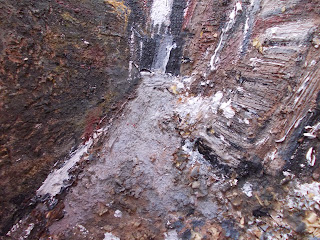
Here is my first painting study inspired by an entry near 12 quays. I was inspired by the suggestive mark-makings of Frank Auerbach's urban landscapes and tried to incorporate similar techniques into this painting. I used card to blot in the flat layers before applying more detail with my pallet knife.. Quite often I would let the paint dry for approximately five minutes to build texture. Once the surface dries I would work back into the study and adjust the colour contrasts in order to make it look accurate to the photograph I was working from. I find this works quite well, although I feel my sense of perspective could do with working on.


Quick Alleyway Drawing (approx 10 mins)

In college, I was assigned a task to produce ten quick sketches of my alleyway photographs. This allowed me to test my drawing skills and see what kind of marks I can make within the time frame I had for each study. The drawing above demonstrates just this. The lines are quick, vigorous, and gestural. As well as drawing with my graphite stick, I also used my rubber to draw into the lines to create quite spontaneous  marks reminiscent to the stylized drawings of William Kentridge. I think for the time constraints I had this is quite an intense drawing with many qualities that would influence my drawings to come.


Quick Alleyway Drawing .2 (approx 10 mins)

Just like the previous study, I quickly drafted out the composition before incorporating more suggestion of detail. This proved to be quite tricky because I had to move draw quickly if I were to capture everything within the photograph I was working from. While applying the graphite onto the paper, I would smudge into the lines with my fingers to create more tone in which I would later manipulate with my putty rubber. This was a very useful technique for suggesting depth and detail particularly for the discarded objects at the far end of the pathway. 


Quick Alleyway drawing .3 (Approx 10 mins)

Here is one of the strongest studies I produced. By this time I was starting to get use to the speed I was working at which allowed me to "loosen" up slightly. What made this exercise more enjoyable was that it didn't matter if I made mistakes. Because my drawing style consists of gestural mark-making and intense visuals, mistakes are very easy to edit.  Here I managed to incorporate a variety of marks with my graphite stick and enough tone to suggest depth and shadows. I think the viewpoint of the photograph I was working from helps to make the drawing look more dramatic, especially with the metal pole facing towards the architecture at the far end of the road.


Quick Alleyway Drawing .4 (Approx 10 mins)
Another of my favourites is this drawing above. The viewpoint was taken about 4 yards from where the previous image was taken. In terms of the mark-making, I tried a slightly different approach. Instead of incorporating single gestural lines, I applied harsh layers of graphite which enabled me to create intensely dark tones. I then tried removing some of the graphite with my putty rubber which creates strong contrasts of light between the two opposite buildings.  


Quick Alleyway Drawing .5 (Approx 10 mins)

In terms of composition and colour tones, this one works very well. While I think I could have incorporated more gestures to the outlines, I still think the visual qualities make this one of the more significant drawings I've produced. Similar to the previous drawing, I applied some tone with my graphite stick before incorporating lines to suggest detail. I'm particularly pleased with how the two public bins contrast with the black gate at the far end of the pathway, which in itself looks quite uncanny.


Quick Alleyway Drawing .,6 (Approx 10 mins)

Out of all my ten drawings, this one here seems to be the busiest in terms of mark-making, gesture, and tone. I drafted out the composition by drawing quick, loose yet confident lines which add to the quality of the intense visuals. I then began applying strong graphite marks to suggest the darker areas followed by the application of the putty rubber which brought back the lighter tones. To me, not only is the mark-making convincing, but the viewpoint if the image re-enforces the intensity of the drawing.  


Mixed-Media Painting Study on Board .1

Here is my first mixed-media study in which I used similar techniques as my final outcome for the "out of the ordinary project". Much of my inspiration came from the heartfelt, minimalistic buildings of Peter Doig and the intense surface qualities of abstract expressionist David Tress. To begin, I fused early objects such as saw dust and sand onto a wooden board using P.V.A glue. I then applied a quick wash of white paint before incorporating the intense colour contrasts. As well as using dark browns, I tried mixing other colours such as orange, reds, and whites to get a range of tones in which I applied onto the surface with accuracy and gesture using tools such as a paint brush and a pallet knife, all of which add to the intense visual qualities of the painting. While the two opposite buildings are highly textured, I kept the buildings at the far end of the pathway quite flat and minimalistic in order to capture the sense of distance from the 12 quay's campus and my current viewpoint. All in all I am very pleased with the end result. I feel both the colour contrasts and the texture fuse well with one another.


Mixed-Media Painting Study On Board .2

Just like the previous painting, I collaged a range of materials such as sand, saw dust, and news paper to create a highly textured background. I tried to maintain a balance between textured and flat layers in order to suggest depth and distance once I begin to apply colour onto the board. For the building on the left, I quickly blotted a flat layer of dark brown before adding gestural mark-making to suggest detail. While applying colour onto the brick walls, I carved small rectangular shapes which seem to give the painting a sculptural quality reminiscent to some of the landscapes of Anselm Kiefer. This side of the painting contrasts with the flat, suggestive visuals at the far end of the pathway. I steered away from incorporating too much texture as it would ruin the sense of distance from the gates at the far end of the alleyway and my current viewpoint. I feel a significant aspect of this study is the door on the left hand side due to it's gritty realism and abstract qualities which seem to resemble the decayed visuals of DADA artist Antoni Tapies. The building on the left looks may be lacking in perspective, but the idea of having the buildings in the foreground textured and the end of the pathway flat has alot of potential.


Mixed-Media Painting Study On Board .3

Out of all three of my final painting studies, this one appears to be the most abstract. Unlike the previous two paintings were I tried to capture a sense of perspective, I wanted to capture the intense grittiness of the alleyway itself. Once again I incorporated organic materials onto the wood leaving only the top middle section relatively flat as it was were the end of the pathway was going to be. I quickly blotted the first layers of colours over the texture before adding suggestion of detail, although most of the time I would let the texture do the work. It too some editing to tidy up the building on the right hand side as it looked quite muddy to start with. I also found the ground itself to be quite tricky to correct because it was getting lost with the news paper collage beneath. To me, the most convincing aspects of this study are the gates at the far end of the alleyway and the weathered concrete walls on the left hand side. I find the suggestion of detail at the far end gives this study quite an minimalistic quality while the dark, organic colour contrasts on the left hand side fuses with the gritty textures which brings s sense of realism to the study. The dramatic angle of the composition is another successful aspect and is something I will consider for future painting studies.

Sunday, 22 January 2012

Book project


Book experiment 1
In this book piece, I wanted to experiment with texture and heartfelt subjects such as war. For the first page, I pasted an image of seemingly enthusiastic soldiers marching into what would soon me their impending doom. Below is some text I ripped out from one of my Catholic prayer books, similar to a quote from the "book of psalms". This rather naive first page surprisingly contrasts with the second page, decimated after the horrific aftermath of war. To represent the carnage, I collaged many images of wounded soldiers, medical drawings, and sprinkles of sand around the page. The page title "Dead Souls" was made up of texts from a news paper and from one of my prayer books. The intention was to show no matter what the reasons are, war is futile.  


Book experiment 2
The techniques used to produce this book piece were very different from what I'm normally use to. I tried experimenting with delicate processes such as cutting, carving, and paper manipulating, similar to the techniques practised by Brian Detmeer. I removed the map of the Vatican on the first page and pasted it on top of an image of a wounded soldier I pulled out from an old war book. While it may be quite a decent piece in it's own right, I doubt I'd want to use these techniques for my final ideas. 


Book experiment 3
In this piece, I wanted explore textured surfaces. To do so, I soaked this book underneath a running tap and I began to scratch away the modern looking book cover to make it look more decayed.  I pasted an image of the Virgin Mary on the cover to bring a sense of spirituality to the book. I opened up the inside of the book and, coincidently, the water soaked right through the pages into a shape of an angel. Inspired, I decided to collage religious text over the soaked areas to bring out the angel figure. I added some wings on both sides of the book to extend the figure more. This is definitely one of the more interesting pieces I've produced thus far and may well continue to explore surfaces for my upcoming book art pieces. 


Knife wound book
This is one of the first experiments that leads towards my final theme for this project. I flattened a number of book pages into a square shape and fused them together using latex. Once the latex dried, I created the visceral knife wounds with a craft knife. While the piece works well in it's own right, I feel I could go much further with the surface qualities in order to represent the graphic nature of a knife wound.


Bounded
Perhaps the most eerie book piece I've produced as part of my installation is this piece, entitled "bounded". I got the idea from the first scene of Rough Justice by Stephen Leather were three drug dealers were being brutally interrogated by a group of vigilante police man while being tied up. I tightly rolled up two books and pieced them together using latex. I then wrapped white thread dipped in orange ink around the book to give the implication that the book  has been bounded by ruthless vigilantes. I then pasted some paragraphs from the interrogation scene itself in order for viewers to get a better idea of what this piece represents.


Hard as nails
In this book piece, I pieced two solid books together using latex. The intention was to represent an individual who considers themselves indestructible and,as the title puts it, "hard as nails". Considering that not alot of techniques was required to produce this, this is actually quite remarkable.


Sliced

One of the strongest and perhaps most edgy pieces is this one, entitled "sliced" I used one of my books I already damaged and I began violently cutting into the surfaces with a craft knife. After noticing how far I've cut into the book, I dug my fingers into the wounds and open out the gashes to show the text beneath, making the surface look even more violated. This is definitely one of the more visceral books I've produced and will go towards my final outcome.


Gunned

One of the easiest yet most visually effective book I produced was this one above. I simply soaked one of my spare books under a tap and let the somewhat modern looking book covers dissipate. After waiting for it to dry, I drilled several holes with a power drill to create several holes which represent horrific entry wounds suffered from gunshot blasts. This idea was inspired by the final chapter of the book I was working from entitled "Rough Justice" in which the main antagonist is killed by gunfire by armed police. 


Burned

This book here was one of the most enjoyable and potentially dangerous books too produce. The theme was inspired by a chapter of the book "Rough Justice" in which an arson attack took place. I took the book down into the 3D room and began applying the horrific burn marks using a hot air gun. It was important that I used the hot air gun under an air vent to prevent the fire alarms from going off and at times I had to apply water to the marks to stop them from burning. The process was quite risky, but the outcome was hugely satisfying.


Battered.

Out of all the books I've produced, this one is probably the grittiest and most quirky both in terms of it's theme and the surface qualities. After removing hardbacks from two different books, I began to play around with the shapes by manipulating the different corners of the books into awkward angles, almost as it the book has been brutalized by gangs in a fist fight. These two books are later fused together with latex which also helps to create the gritty surface qualities. I then collaged some text from a chapter of "Rough Justice" in which  drug dealers are violently beaten by vigilant cops. The nature of the book may come across quite controversial to some viewers, but hopefully people will appreciate the intense physical qualities. 


"Rough Justice"

Here is my final outcome for the book project. After producing all my textured book, I began too look around for something to mount them on. I found this discarded cabinet near the college skips and decided to "redecorate" it. Luckily I was given pamission to use dangerous tools such as an axe and an ice pick to hit the cabinet with. I attacked the left hand side with the axe to suggest grisly flesh wounds and the ice pick to suggest entry wounds suffered from gunfire, all of which add to the violent nature of the installation. After I finished applying the wounds, I painted the cabinet with a coat of white paint to make it look more uniformed for when I finally stack my books. As part of a competition, this was voted the most "quirky" which later won me a prize.


Fine Art project: Out of the ordinary


Clock drawing
This is my my first observational drawing of a clock which hangs in the backroom of my household. After quickly drafting out the proportion of the clock, I began to apply strong contrasts of light and dark to bring more deph to the drawing. To suggest that light is coming through on the left hand side, I applied more preasure to my graphite stick to get the dark shadow on the right hand side. To bring back the lighter tones, i worked heavily onto the drawing with the putty rubber. I would later rub my finger over the graphite and blend the lighter tones with the dark areas, bringing me a slightly surrealistic quality to the drawing.


Drawing experiments

On the first day of this project, our first tast was to produce a series of drawings of household objects using a variety of techniques. Some of these techniques may include drawing with your left hand (top right), without taking the pencil off the paper (middle), or with your eyes closed. The right-handed drawing of the pair of goggles is by far the best drawing I managed to produce. The bold, jagged lines are remenisnt the the drawings of Frank Auerbach. I feel by taking part in this project my drawing skills would become more versitile if I were to apply these new drawing techniques to my work.


Screwdriver Etching (Before and After)
This session provided me the opportunity to explore different ways of etching with a variety of tools. I used the screw driver as the prominent object as I was fascinated by it's overall proportion. For my first etching, I began by drawing out the object before working onto the outlines with tools including a craft knife andn extremely sharp pencil. My first etching (left) is rather basic and just represents the screwdriver in its most basic form. To take my etching techniques further, I produced the second piece (right) using tools such as a circular blade, pins, and the end of my scissors. By working heavily both into the screw driver and the background, I feel I've explored the potential of using different tool to enhance my etching techniques.


Ink work 1
To make our drawing techniques more versatile, we were asked to produce a series of ink drawings using a wooden stick as the prominent drawing tool. I was inspired the loose, gestural drawings of the Japanese artist Velasco, who is most renowned for her ink drawings of animals. While drafting out the object I was working from, I tried experimenting with different ways of applying ink onto paper. To suggest shadows, I would apply thinker layers of ink and thin, watery layers for the highlights. I kept my drawing style jagged and scratchy in order to maintain the distinctive visual qualities I'm currently developing. Overall this was a successful session, one while I thoroughly enjoyed and will come back to in future projects.


Textured painting experiment


Textured painting on board 1


Textured painting on board 2


Textured painting on board 3


                                                                  A1 Painting Study
Before embarking on my exploration into painting, I researched a number of artists in the hope to find inspiration for my own visual ideas. After researching the heartfelt works of Anselm Kiefer, I realized that texture, dirty backgrounds, and gestural mark-making were the areas of my success. In my first A1 painting, I wanted to exploit these techniques. After creating the ground using spontaneous brush strokes and thin layers of paint, I began painting the objects I was working from. I applied the first layers of paint with a watered down paint brush before building up thick texture with my pallet knife. The object I'm most proud of is the metronome and how the naturalistic browns contrast with the hint of red paint on the left side of the object. This painting, to me, works pretty well in terms of it's colour contrasts, although I think it's perspective could be better.
 

Final Painting on Board
For my final painting, I wanted to bring all the successful aspects of my previous studies and incorporate them into what I believe to be one of the best works I've produced on this course thus far. To begin, I created the highly textured ground using organic materials such as saw dust and sand. Once the PVA glue fused onto the board, I blotted in the background using watered down paints, similar to what John Piper does for his paintings. Soon I began to incorporate gestural mark-making over the background using a range of paint brushes and, my personal favourite, the pallet knife. I only used three objects as I felt sometime "less is more".  The colourful gestures seemed to fuse with the heavily textured background successfully, pushing the painting towards abstraction. To me, this is almost like a tribute to abstract expressionism, hopefully something David Tress would admire.  

Wednesday, 2 November 2011

Project three: Bird project


Eagle sketch with graphite pencil
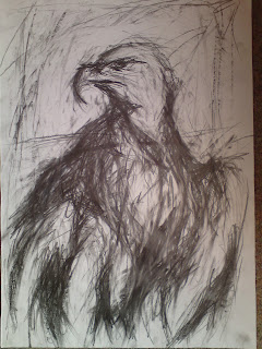
For our homework, we were asked to produce at least six drawings of birds and represent the different character traits given on the brief. To represent masculine birds, eagles came to mind instantly. As well as observing the detail within the face, I also wanted to incorporate bold pencil marks around the body to make the eagle look more intense, adding to the dramatic ,movement of the eagle.


Charcoal drawings of eagles
Some of the strongest pages in my sketchbook include these charcoal drawings of golden eagles. Perhaps the  most accurate observational drawing is the side-view of the eagle's head. I feel I've captured the patriotism in it's facial expression, especially when looking at the stare in it's eyes. The drawing above was quite tricky to produce probably because I was running out of space to draw the outspread wings on the eagle. I think this would have worked much better if I drew it on a separate piece of paper in which I can express the dramatic movement of its wings.


Magpie drawings
I feel the strongest drawing is the black and white graphite drawing on the left because of its bold pencil marks. When drawing the feathers, I used my rubber to spread some of the marks to bring out some of its highlights. The coloured pencil drawing on the right could do with some work. I think if I used less graphite tones the colours would show much better.


Goldfinch drawings
For this page, I solely focused on colour. To draw the goldfinch on the left, I drafted out the basic proportions of the body before applying layers of tone with a range of coloured pencils. The drawing on the right took a while to improve because the first layer of coloured pencil marks weren't working for me. I decided to apply gestural marks with my soft pastels to bring out the colours which were getting lost with the graphite. Perhaps colour isn't my strongest area, but I think a bit more practice will improve these kind of drawings.

Stitching of a Raven
For our first drawing exercise, we were asked to produce a drawing of a bird using hand stitching techniques. I used one of the simplistic images of a raven as it would be easier to work from. While stitching into the paper, I would plot some faint pencil marks for when I apply my next thread. Considering I rarely do handstitching this seems to work quite well. Due to the time constraints I was unable to fully complete this, however I think this technique has some potential for future projects.


Eagle drawing with fread and PVA glue
Similar to the previous exercise, we had to use thread to draw our birds with, only this time we use P.V.A glue to paste the outlines onto the piece of paper. It started off quite fiddly, but once I began manipulating the strings to get the proportions of the seagull it started to take its shape. What works well is the simplicity of the outlines, particularly were the wings meet the body of the bird.


Upside down drawing of Raven
For this exercise, we had to turn one of our bird photographs upside down and draw what we see from that perspective. To make this task easier, I quickly drafted out the proportions of the raven with faint pencil marks before building up layers of tone and bold mark-makings. Strangely enough, the proportions of this drawing has turned out much better than the previous version which I had the photograph the right way round.

                                                                  
Raven collage
This exercise was slightly tricky to get started on. We had to use different kinds of paper and collage them into a bird. Originally I tried making a head of an eagle but the result looked dull. Instead I worked from my dramatic image of a raven in flight and concentrated on its tone. I pasted the darker areas first before adding white paper to suggest the lighter areas. This actually came out much better than I anticipated. I'm especially pleased with the outspread wings and the way I managed to define the lighter areas from the dark.


Ink drawing of a Seagull
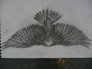
One of the more successful studies I've produced is this dramatic ink drawing of a seagull in flight. First I worked on the darker tones before incorporating mid tones using a stick. There were times were I nearly ruined it by incorporating too many dark tones, but I was able to salvage it by applying the lighter ink lines to suggest layers of feathers. Because I was working on a large piece of printing paper, I felt I was able to represent the dramatic movement within the wings, making this one of the more effective drawings in my sketchbook.


First expressive drawing of raven with graphite stick


Second expressive drawing of raven in flight with graphite stick and charcoal


First expressive golden eagle drawing with charcoal and graphite stick


Second expressive golden eagle drawing with charcoal and graphite stick


Final bird drawings on brown paper