Wednesday, 2 November 2011

Project three: Bird project


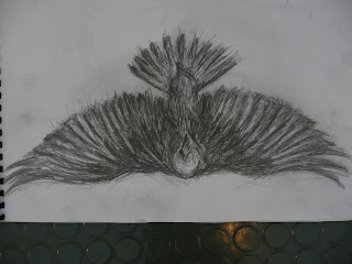
Eagle sketch with graphite pencil
For our homework, we were asked to produce at least six drawings of birds and represent the different character traits given on the brief. To represent masculine birds, eagles came to mind instantly. As well as observing the detail within the face, I also wanted to incorporate bold pencil marks around the body to make the eagle look more intense, adding to the dramatic ,movement of the eagle.


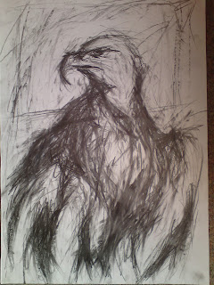
Charcoal drawings of eagles
Some of the strongest pages in my sketchbook include these charcoal drawings of golden eagles. Perhaps the  most accurate observational drawing is the side-view of the eagle's head. I feel I've captured the patriotism in it's facial expression, especially when looking at the stare in it's eyes. The drawing above was quite tricky to produce probably because I was running out of space to draw the outspread wings on the eagle. I think this would have worked much better if I drew it on a separate piece of paper in which I can express the dramatic movement of its wings.


Magpie drawings
I feel the strongest drawing is the black and white graphite drawing on the left because of its bold pencil marks. When drawing the feathers, I used my rubber to spread some of the marks to bring out some of its highlights. The coloured pencil drawing on the right could do with some work. I think if I used less graphite tones the colours would show much better.


Goldfinch drawings
For this page, I solely focused on colour. To draw the goldfinch on the left, I drafted out the basic proportions of the body before applying layers of tone with a range of coloured pencils. The drawing on the right took a while to improve because the first layer of coloured pencil marks weren't working for me. I decided to apply gestural marks with my soft pastels to bring out the colours which were getting lost with the graphite. Perhaps colour isn't my strongest area, but I think a bit more practice will improve these kind of drawings.

Stitching of a Raven
For our first drawing exercise, we were asked to produce a drawing of a bird using hand stitching techniques. I used one of the simplistic images of a raven as it would be easier to work from. While stitching into the paper, I would plot some faint pencil marks for when I apply my next thread. Considering I rarely do handstitching this seems to work quite well. Due to the time constraints I was unable to fully complete this, however I think this technique has some potential for future projects.


Eagle drawing with fread and PVA glue
Similar to the previous exercise, we had to use thread to draw our birds with, only this time we use P.V.A glue to paste the outlines onto the piece of paper. It started off quite fiddly, but once I began manipulating the strings to get the proportions of the seagull it started to take its shape. What works well is the simplicity of the outlines, particularly were the wings meet the body of the bird.


Upside down drawing of Raven
For this exercise, we had to turn one of our bird photographs upside down and draw what we see from that perspective. To make this task easier, I quickly drafted out the proportions of the raven with faint pencil marks before building up layers of tone and bold mark-makings. Strangely enough, the proportions of this drawing has turned out much better than the previous version which I had the photograph the right way round.

                                                                  
Raven collage
This exercise was slightly tricky to get started on. We had to use different kinds of paper and collage them into a bird. Originally I tried making a head of an eagle but the result looked dull. Instead I worked from my dramatic image of a raven in flight and concentrated on its tone. I pasted the darker areas first before adding white paper to suggest the lighter areas. This actually came out much better than I anticipated. I'm especially pleased with the outspread wings and the way I managed to define the lighter areas from the dark.


Ink drawing of a Seagull
One of the more successful studies I've produced is this dramatic ink drawing of a seagull in flight. First I worked on the darker tones before incorporating mid tones using a stick. There were times were I nearly ruined it by incorporating too many dark tones, but I was able to salvage it by applying the lighter ink lines to suggest layers of feathers. Because I was working on a large piece of printing paper, I felt I was able to represent the dramatic movement within the wings, making this one of the more effective drawings in my sketchbook.


First expressive drawing of raven with graphite stick


Second expressive drawing of raven in flight with graphite stick and charcoal


First expressive golden eagle drawing with charcoal and graphite stick


Second expressive golden eagle drawing with charcoal and graphite stick


Final bird drawings on brown paper

Project three: Acrobats


Expressive print of flaming juggler
This is one of the first collograph prints I produced during this workshop.I worked with one of my flaming juggler images and tried capturing the movement within the image. I began by drafting out the proportion of the figure, followed by very expressive outlines which help to bring quite a theatrical element to the drawing. If I were to improve this somehow, I would use less tone in the background as it seems to flatten the figure slightly.


Mono print of flaming juggler
To produce this, I applied large amounts of printing ink onto a plastic sheet of paper. I then started to work onto by drawing my theatrical juggler with a range of tools including an old toothbrush, fine liner, and an old rag. Unfortunately because the ink didn't transfer to the paper properly the visuals came out quite weak. If I used thicker amounts of ink, this would work turn out much stronger. 


Hellenistic sculpture drawing
This drawing of one of the famous Hellenistic sculptures was a lot of fun to produce. I'm quite pleased with how I managed to get the proportions of the figures right and to maintain the god-like pose of the main focus in the centre (Laeoon)


Textured collage print
While my textured figure had a fair amount of ink on it, I thought I'd seize the opportunity and produce a quick but effective print of the uni-cyclist. After printing the figure, I then decided to draw some arms where the sleeves end, creating quite an interesting contrast between single lines and intense texture.


Collage print 2
This is probably the most successful print I've produced in this workshop. I placed my textured uni-cyclist onto printing paper ,which I then fed through a roller in order to transfer the ink onto the printing paper. I feel the grungy backgrounds blend brilliantly with the well defined uni-cyclist in the centre. Printing is defiantly an area worth revisiting.


Charcoal drawing of combined acrobat performance
In the project brief were were encouraged to create our own circus act. I combined three different circus acts including juggling, uni-cycling, and hooping and produced a somewhat far fetched, yet very stylized circus act.  Charcoal was the most appropriate drawing material to use as it allows me to manipulate the visuals if I wanted to correct a mistake. Also it allows me to exaggerate the performance, creating an act that looks impossible but very exiting at the same time. By looking at this, I feel this could well go towards my final 3D outcome. 


Textiles ink t-shirt
This t-shirt was made with a variety of materials and techniques. This included incorporating psychedelic ink splatters, expressive painting techniques (as demonstrated on the centre figure) and splatters of wax. What I find most successful about this t-shirt is that it doesn't look like it's been overworked. The psychedelic visuals seem to resemble the expressive visuals demonstrated my the works of Edvard Munch.


Unicycle macket
To produce this 3D piece, I folded layers of news paper to create the main body. After attaching the limbs, I then cut out some stylized shoulder blades to give the sculpture a lively persona. To finish, I attached the figure to a uni-cycle which I made separately. As a 3D macket, this was pretty successful. I think by working on a smaller scale it made it easier to get the proportions to look balanced.


Henry Moore sculpture drawing
Here is a drawing of one of my favourite sculptures by Henry Moore titled "Warrior without shield". The surrealistic forms of this sculpture brings quite an edge atmosphere to it, representing the damage that war has left on its soldiers. 


Second acrobat print
To produce this print of a hoopist, I used similar approaches as my previous print, only this time I was careful not to work too heavily into the background. By drawing layers of outlines and defining the tones on the figure, I feel visually this much more effective.Once again I think I may have overdone the background slightly,  but I think this way of drawing has potential and could up to to future projects.


Final maquette 
For our last task, we were asked to get ourselves into groups of six. We all agreed that the best idea would be to make our own maquettes and join them together to create our own circus act. I decided to use my trapeze uni-cyclist drawing as my main inspiration and also because it would look quite dramatic. Of course I had to simplify it in order to make it possible to produce. While I was working on the main structure of the figure, I sent some of my colegues away to design the different objects needed to complete the figure. E.g. a uni-cycle, and a cape to make the figure look more theatrical. I feel the end result turned out much better than anticipated. The fact that we were able to combine our sculptures together to make one very exiting circus act was very satisfying indeed.

Project two: Animation project


Car drawings with graphite pencil
These are some observational graphite drawings of my transportation toy. I wanted to represent the vehical by drawing all the different view points, starting with the drawing on the left. I found the bottom right hand drawing was quite hard to perfect because I kept making mistakes with the proportions of the bonnet. 


Ink experimentaion
For this exercise, we had to experiment with different ways to apply inks using our chosen vehicals. First I quickly blotted in the backgrounds and then I had a go at drawing the land rover with bleach. I think this one works quite well because of how I incorporated gestural brush strokes to suggest the car is driving at a high speed. 


Character design sample 
This is one of my first stereotype drawing of a vigilante cop. I loosely based the figure on the actor Wesley Snipes but added a biker's jacket and a colt. 45 pistol with a laser scope attached to it. The stylized ink outlines seem to work really well for this kind of character and I think it blends nicely with the simplistic collage background, once again proving that sometimes less is more.


Left-handed pen drawing
For this exercise, we had to draw our chosen vehicle with our left hand. The object to this is to make our drawing technique more versatile, rather than try to draw a precise observational drawing. Instead of being too precious with the drawing, I decided to loosen my left hand slightly and draw layers of child-like out lines which I think worked best for this exercise. This took approximately 2 mins to draw.  


Paper manipulation
This is one of my more interesting examples of paper manipulation. To represent the work "spiky", I decided to cut out my piece of paper and make it look as though someone is being impaled on some kind of torture device covered with spikes. The outcome is quite eerie, but I had fun because it got me to think outside the box, especially when describing unusual words using paper.


Failed ink experiment
This was one of my experimental pieces were we got to chose what medias to incorporate. The reason why this is unsuccessful is because I applied too much ink onto the car which blended too much into the news paper collage. Perhaps if I used less collage then this would have worked better.

Project one: Walkabout


First walkabout sketch of battleship
While on my walkabout of the urban areas of Birkenhead, I knoticed this battleship in the far distance. I decided to focus on the structure of the design and it's edgy corners. For drawing style, I wanted to try out the quick, sharp line technique practiced by Frank Auerbach. I found his drawing style was most appropiate for this particular activity because it captures the grittieness of these urban vehicals.


Charcoal drawing of abandoned boat
While investigating the docks, I stumbled across this half sunken boat. I did a quick charcoal sketch in which I tried to capture the atmosphere of my current location. I then took this drawing back into the studio and worked heavily to bring more depth to the visuals. I think the expressive outlines bring quite a quirky element to the drawing. I'd be quite keen on building upon these drawing techniques for future projects.


Graphite pencil drawing of abandoned boat
This stylized drawing of the abandoned ship was drawn with a number of medias; grapite pencil, small amounts of collage, and a hint of charcoal. I took inspiration from the intense drawings of William kentridge and applied it to this observational drawing. If I were to alter anything about this, i would pay more attention to perspective and try to define the distance between the backgrounds and the boat itself.


First mixed media painting of abandoned boat
This was the first mixed media image I produced using a vast range of medias and techniques. First I collaged layers of news paper and then I began to apply spontaneous mark-makings using acrylic paint. I used one of my abandoned boat photographs to give this image some kind of form. I used materials including a toothbrush and a pallet knife to apply the dirty acrylics onto the news paper collage. The scratchy mark-makings and aggressive outlines seem to manifest together to create something quite abstract. As a first mark-making experiment, I think this works quite well, but I had to keep in mind not to spend too long on one piece since we were asked to produce a number of grounds.


Second mixed media boat painting
For this image, I continued to work with my abandoned boat photographs, only this time I turned one of them upside down. I wanted to be more flexible with how I interpret what I see. After incorporating some news paper collage, I began applying sharp black lines with my pallet knife. Afterwards I put a dirty wash over the image and worked back into using greys and white acrylic paint. I carefully applied white paint onto the boat in order to make it look more special in contrast to the blotted backgrounds. In terms of mark-making this works really well. What I think I should start to think about if bringing more composition and perspective in order to make my images look more convincing.


Mixed media image depicting life on the road
This image was originally just a collage piece with typography printed over it. To create the lettering, I used a piece of plastic shaped into letters in which I rubbed an old sponge with  dirty yellow acrylics into the letters. I then tried painting typography onto a piece of plastic which I then flattened onto the grounds, creating quite an interesting print-like effect. However I still felt it was unfinished. I decided to draw some fast moving cars using a combination of charcoal and white chalk. If I were to improve this image, I would think more about the composition and how I can bring more definition of perspective rather than have thee cars jumbled with the lettering.


Textured image of long road
This was one of the hardest images to produce. My aim was to try and define the distance between the bridge in the background and the road closest to my view point. First I drafted out the composition and then I began incorporating collage into the road. I then had a go at scratching away some of the collage to suggest the texture within the road. I then tried rubbing watered down grey paint onto the upper area of the road to suggest distance. I then had a go at defining the cars and the bridge within the background using charcoal and paint. The problem is that the backgrounds look too static. I think if I worked less into the bridge and perhaps even apply hints of marks to suggest a background it could improve this image slightly.


Final painting of abandoned boat
To produce my final piece, I drafted out the composition of the landscape with charcoal. I focused much more on the composition which was what my previous experiments were lacking.  I then tried painting onto the wood but the acrylic wasn't sticking to the dry surfaces very well. Instead I applied news paper collage and tried a again. I decided to use my pallet knife as my main tool because of how it makes my mark-makings very textures. I feel I've learned a lot from producing this painting. I've learned how to make the water on the horizon look more convincing, and how to use colours including orange and yellow will help to define the main object of the image, similar to what contemporary artist Richard Harrison does for his dramatic landscape paintings.